LIONSGATE's Production logo
The Lionsgate logo is placed in the centre of the image, which is a sky fill of clouds. where the logo is placed, there is a gap in the clouds, as if it is reaching out to heaven, or "greater places". It fits almost every genre as film as it can be interpreted in many ways. For example, the clouds can represent a fantasy theme, or a supernatural theme. It could mean life, or it could mean death.
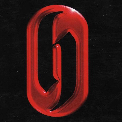
Hammer are mostly known for their films being that of horror, thriller and gore. Their logo fits this quite well as the red can represent blood, and the blackness can represent mystery. Their logo is quite Gothic, but new. This logo was introduced in 2007, whereas, before that, it was different
The colours where the same, red and black, but the style was old, unfashionable and look more like Gothic horror. The newer logo can fit the genre of Thriller as well as Horror.
By Lily, Tom, Joe, Laura and Esther

No comments:
Post a Comment